In this blog, I would be giving a small view of a dashboard that I have created for cancelled flights using an Essbase ASO application as data repository and using Oracle Data Visualization Desktop as the rendering technology for the graph.
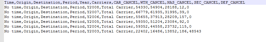
The below snapshot shows the data that I want to visualize.

A brief description of the data that is present above.
Now, whenever a domestic US flight is cancelled, it might be because of one of the following reasons:
• Carrier cancelled the flight.
• Weather caused the flight to be cancelled. (This is the case when you have snowstorms and airports shut down)
• NAS cancelled indicates that National Airspace System glitches caused a flight to be cancelled. (For more on NAS, https://en.wikipedia.org/wiki/National_Airspace_System )
• Security reasons caused a flight to be cancelled.
We will now try to see how the breakdown looks on a five-year basis.
The below snapshot shows the data as imported into my Oracle DVD.
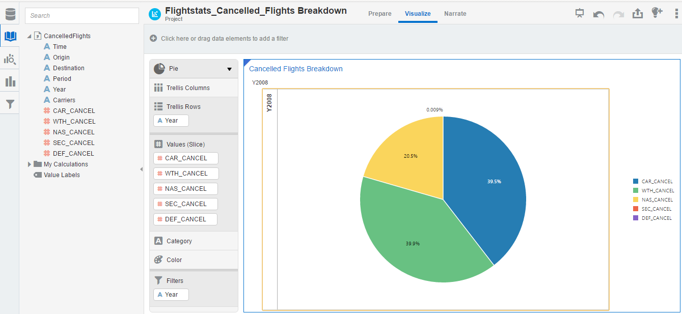
 I create a pie chart with a year dropdown to see the breakdown of cancelled flights for a given year.

Now based, on the above pie chart, carrier cancellation and weather cancellation led to almost equal number of flights being cancelled in 2008. Weather cancellation leads by 0.4 percent as compared to carrier cancellation.
If I set my pie chart to be in explode mode, I can see that Security cancellation led to least number of flights being cancelled in 2008.

I now change the year to be 2007 and see the cancellation in that year.

 If you see the above pie chart, carrier cancellation led to more flights cancellation that weather-related issues. NAS system cancellation and security cancellation remain fairly average over the two years.
Carrier Cancelled flights by Year on a bar chart is as shown in the below snapshot.
 Weather cancelled flights on year-to-year basis is as shown below.

Security cancelled flights on YoY basis.
 Security Cancelled flights on a YoY basis is as shown in the below snapshot.

A stacked bar chart of all the classification for flight cancellation for five years is as shown in the below image.
 (Point to note: If you observe the data for Y2003, they do seem to be a bit below the expected range. This is because till 2003, we don’t have a lot of granularity in terms of why flights were cancelled. That’s the reason why data in 2003 looks like outliers… However, in you look at the above graph, you will see that statistically it should still be in range)
The below snapshot shows the data that I want to visualize.
A brief description of the data that is present above.
Now, whenever a domestic US flight is cancelled, it might be because of one of the following reasons:
• Carrier cancelled the flight.
• Weather caused the flight to be cancelled. (This is the case when you have snowstorms and airports shut down)
• NAS cancelled indicates that National Airspace System glitches caused a flight to be cancelled. (For more on NAS, https://en.wikipedia.org/wiki/National_Airspace_System )
• Security reasons caused a flight to be cancelled.
We will now try to see how the breakdown looks on a five-year basis.
The below snapshot shows the data as imported into my Oracle DVD.

Now based, on the above pie chart, carrier cancellation and weather cancellation led to almost equal number of flights being cancelled in 2008. Weather cancellation leads by 0.4 percent as compared to carrier cancellation.
If I set my pie chart to be in explode mode, I can see that Security cancellation led to least number of flights being cancelled in 2008.

I now change the year to be 2007 and see the cancellation in that year.


Carrier Cancelled flights by Year on a bar chart is as shown in the below snapshot.


Security cancelled flights on YoY basis.


A stacked bar chart of all the classification for flight cancellation for five years is as shown in the below image.

Thanks for sharing info on Exploits in Hyperion
ReplyDeleteThanks for sharing information....
ReplyDeleteIELTS Coaching in chennai
German Classes in Chennai
GRE Coaching Classes in Chennai
TOEFL Coaching in Chennai
spoken english classes in chennai | Communication training
This concept is a good way to enhance the knowledge.thanks for sharing..
ReplyDelete| Certification | Cyber Security Online Training Course|
Ethical Hacking Training Course in Chennai | Certification | Ethical Hacking Online Training Course|
CCNA Training Course in Chennai | Certification | CCNA Online Training Course|
RPA Robotic Process Automation Training Course in Chennai | Certification | RPA Training Course Chennai|
SEO Training in Chennai | Certification | SEO Online Training Course
I cannot thank you enough for the blog.Thanks Again. Keep writing.
ReplyDeleteP0wer bi onlinetraining
P0wer bi training